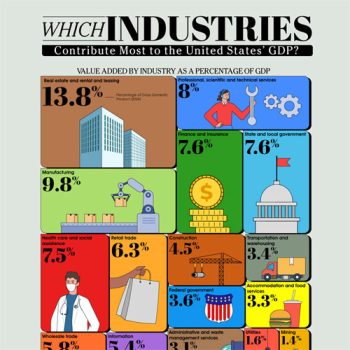
A new study from the Chartistry reveals the power of data visualization. Their infographic displays the top employers by sector using differently sized bubbles to show which employs the most people. Walmart dominates the chart with the largest bubble representing an incredible 2.2 million employees. The clean graphic utilizes recognizable company logos, making it an easy chart to navigate and gain insight with just a quick glance. Diving deeper into details will reveal even more facts and insight into the state of the American workforce. Charts like this one strike a great balance between visual impact and in-depth information, providing insight into society.
Brought to you by: Thechartistry.com
Color palette:
#000000
#3f2c25
#fba489
#448f95
#e5594b
#807f9c
#14519a
#e61626
#f2c200